Crafting a human first screening / validation web and native app experience
Introduction & Industry Status Quo
In all likeliness one of the apps that are installed on your phone have a screening or validation flow within them. Think of a banking app or a car sharing app. Once you apply to open a new account or a new credit card the system would ask you to go through different types of screenings. Normally that process is tedius, boring and super user-unfriendly.
The challenge
Creating a human-first, user-friendly, white-label validation web app with native iOS and Android components. Needs to be accessible from both mobile and desktop and scalable to support different types of validations like livelyness, passport, ID or reference check now and in the future. WoW.
The Process
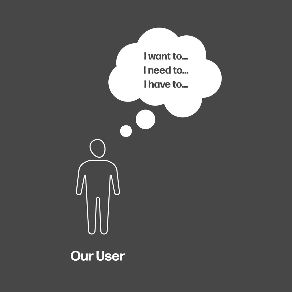
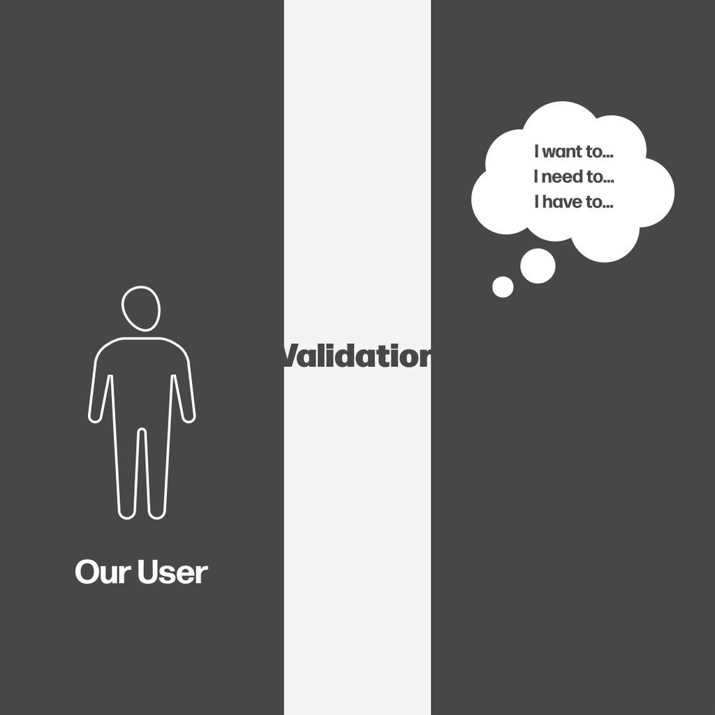
Who are we designing for?
Identifying our target group, users and personas. We want to make this a great experience for everyone so we identified 3 people from different backgrounds swith different goals.

Jaimy・VM manager・28
・Always dreamed to be a teacher ・Applied for a university she adores ・Got accepted ・Part of the process is to validate her documents Wants to enter the university she applied for.
Jaimy・VM manager・28
・Searching for a job in the hospitality sector ・Low computer literacy ・Found a job he likes ・His future employer wants asked him to validate his documents Wants to get the job he applied for.
Jaimy・VM manager・28
・His mother is ill ・He have found what he needs online ・The company that sells it asks him to validate his documents ・He needs to do that if he wants to help his family. ・Low computer literacy He needs to buy medicin for his family.
Storytelling & Exploration
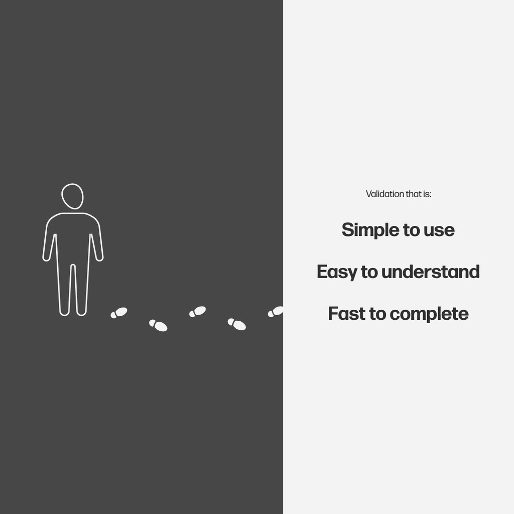
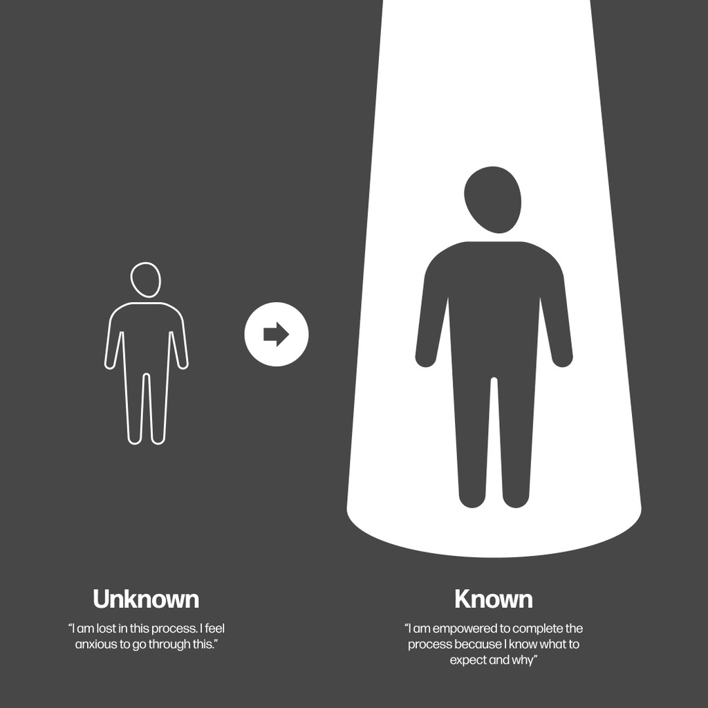
As discussed, validation apps are normally very boring, don't empower the user and become an opstacle rather than a tool. We wanted to do the exact opposite and so we started thinking about how to empower the user throught a great experience and information management. We asked from ourselves to build an experience so user friendly and unique, that users would want to go through it as it feels like it helps them achieve what they want to achieve.
Visual Design
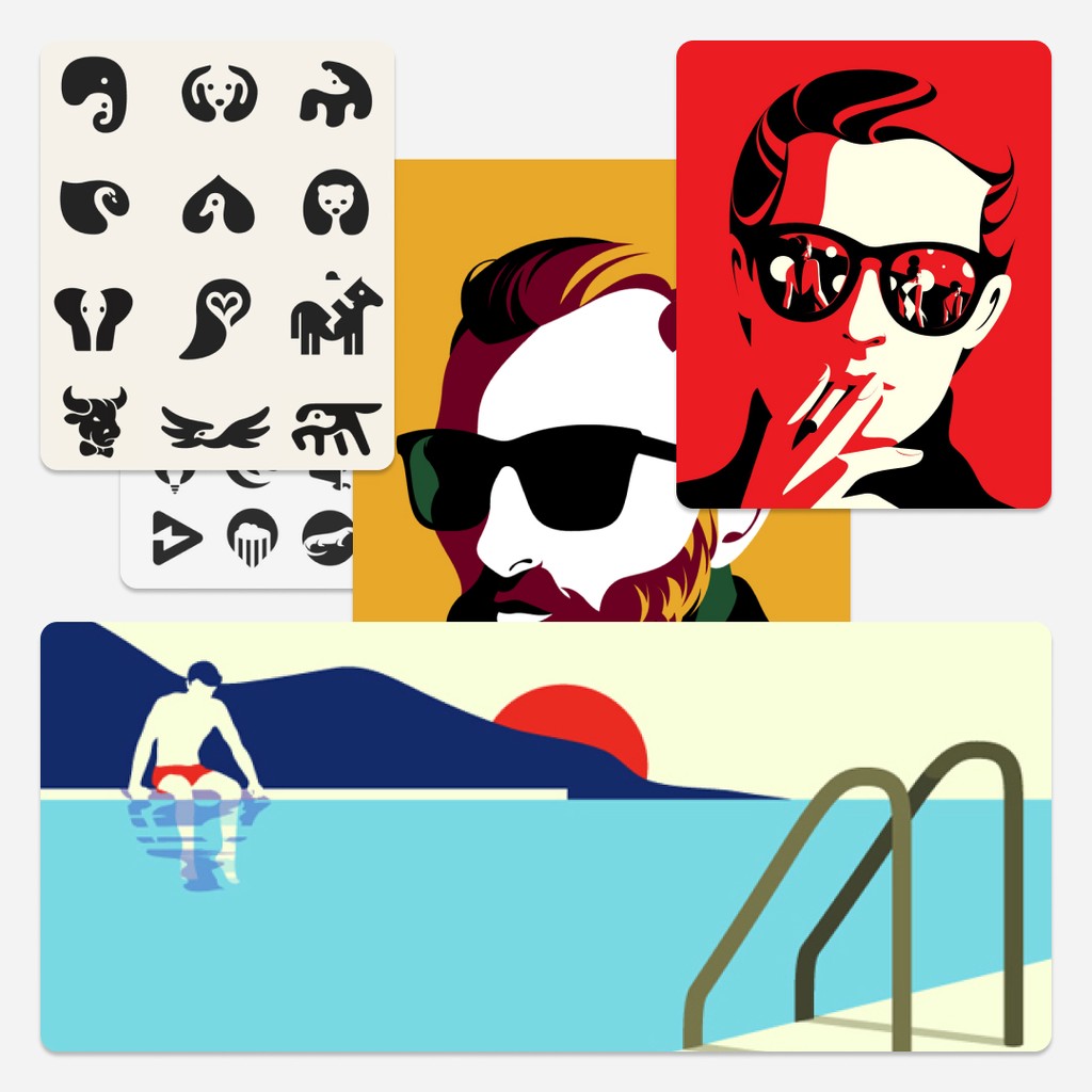
Based on the storytelling concept we felf that a design based on black and white contrast would fit very much. It essentially conveys the transition of the user from the known to the unknown. From an app that is an obstacle to an empowering too. Here's one of the inspo boards we created:
Product Philosophy
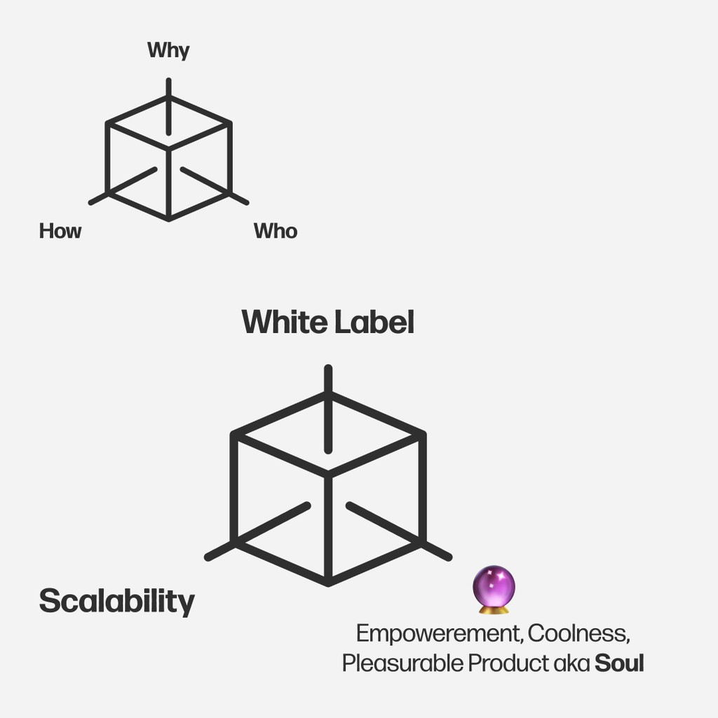
Now that we are familiar with the what (empowering validation), the why (happy users) and the who (user personas), we're ready to build our our product phylosophy pillars. On one side of the product we prioratise for the who, the what and the why and on the other side we prioratise for being white label, scalability and user empowerement, coolness, a pleasurable product experience or what I would call, a soul!
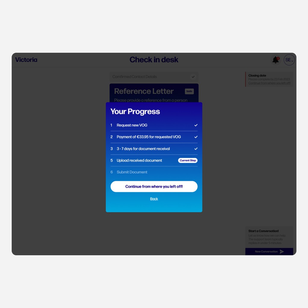
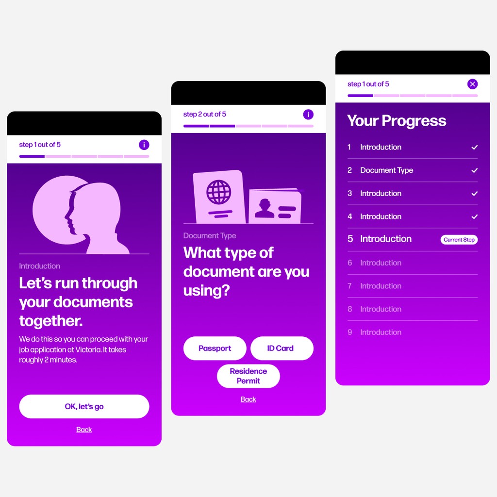
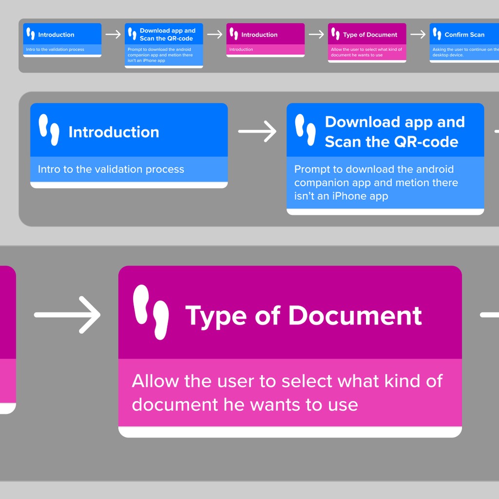
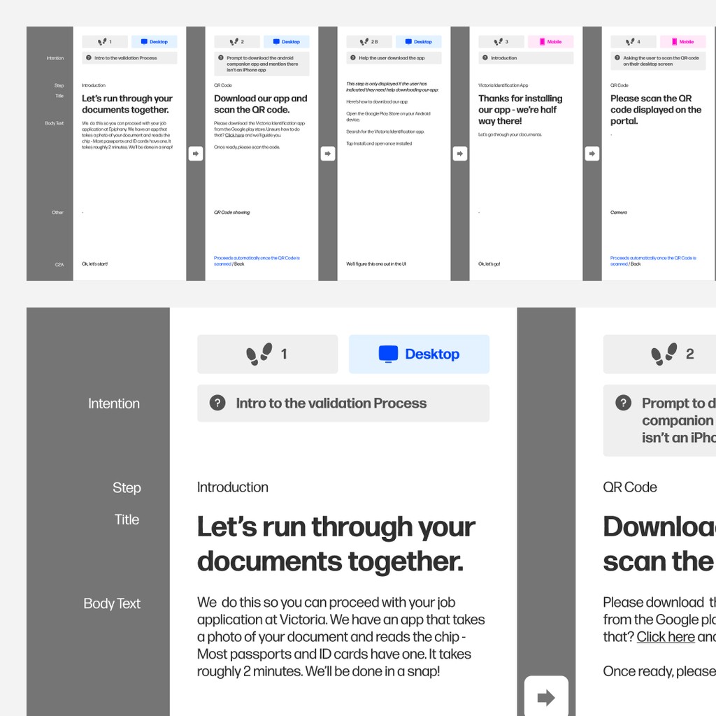
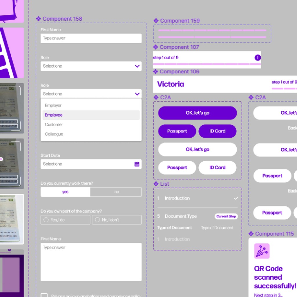
Validation Flow
The validation flow includes all the steps, screen by screen that need to be taken to pull off specific user goals. I build out multiple different ones but here's one example!
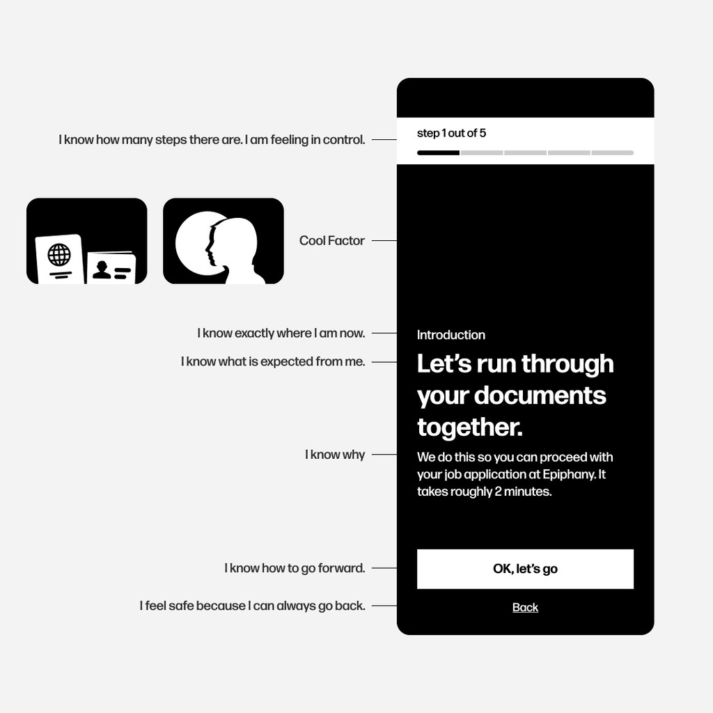
Information Flow
Representing all information that needs to be visible to the user.
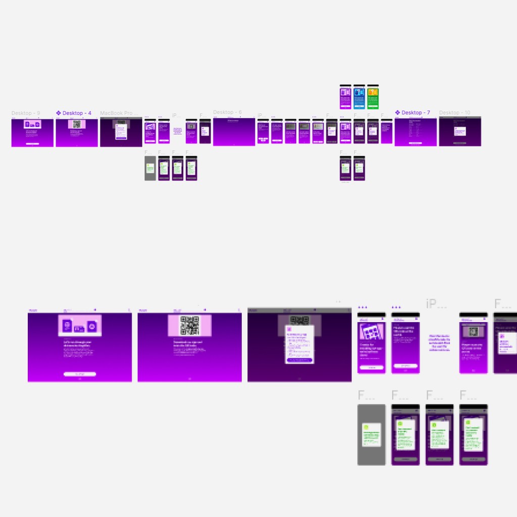
Wireframing
Black and white wireframing. I find that wireframing in black and white helps me focus on the position, the hierarchy and the actuall body of information rather than the style. Style does become important at a later stage.
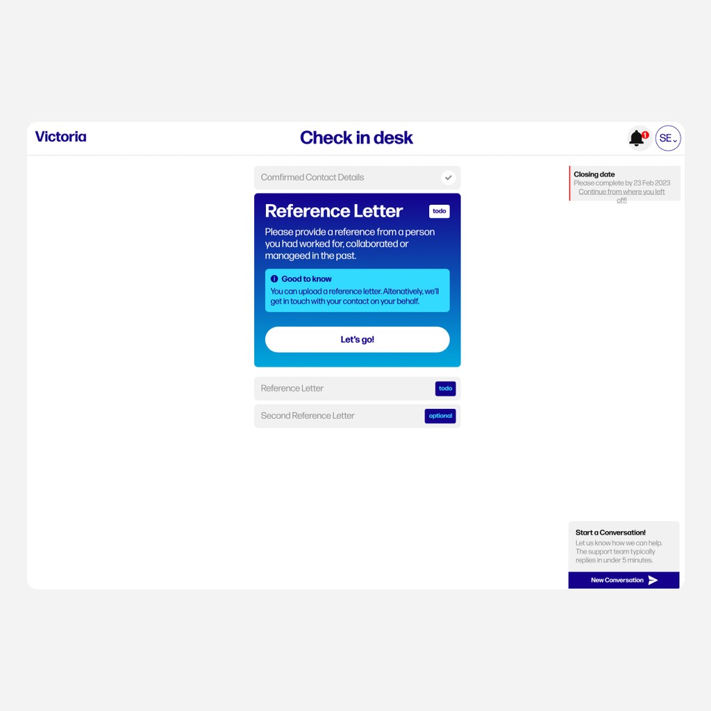
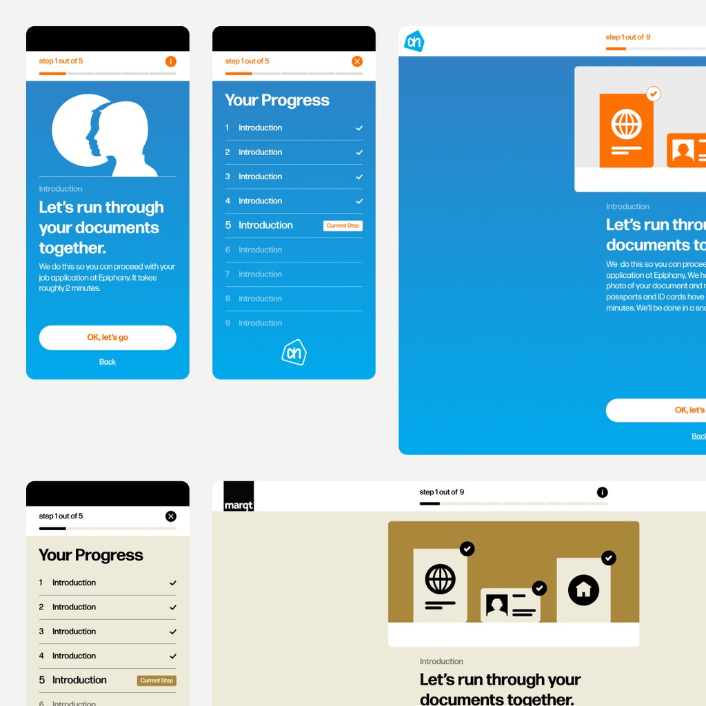
White Label UI
Time to add colour! This app needs to be scalable in multiple ways and one of them is to be white label. In that way it feels like a smooth experience that is connected to the brand or organisation that the user is already aware of. No need for the user to feel like they are interfacing with a different company. It's all part of a smooth end-to-end user experience.
The Outcome
Design System
I naturally built a design system so the team and future collaborators can follow but also drive the concept further without deviating from the core concept.
Usability Testing
This is one of the most important parts of any project. In fact, I run multiple usability tests during different phases of the project. It gives me the opportunity to smooth out anything that might not be clear to the users But the answer to the question "When to run a usability test" is really is dear to me because while it might sound straightforward, it surely isn't. And for good reasons! Every app is different. So the answer depends. 💭 It depends on why you're building the app. 💭 It depends on the purpose of the app. 💭 It depends on what phase of development you are at. 💭 It depends on your resources. 💭 It depends. But one thing is for certain. When conducting usability testing, i allways make sure you test a complete product or a complete part of a product. So in this case I only tested complete flows because that is when I felt I would get the most honest and complete answers. And then impoved accordingly.
Dashboard
In this case study I focused mostly on crafting the iOS and Android apps but of course somebody from the customer side needs to receive and analyse the results. The assigment included designing that part too.