
White-label messaging platform tailor-made for market research
The challenge
Creating a messaging application that is tailor-made for research and doesn't require user onboarding. Oh my! Firstly, what does tailor-made for research mean? Messaging applications traditionally support only text but of course market research demands more input methods like star ratings, single select, multi select, image upload and more. And secondly, why shouldn't it require user onboarding? Onboarding referts to a learning curve from the side of the user but in market research, the longer it takes for a consumer to complete a survey, the more costly it can get. And thus, we needed to design a system that doesn't require onboarding.

The Process
Introduction & Industry Status Quo
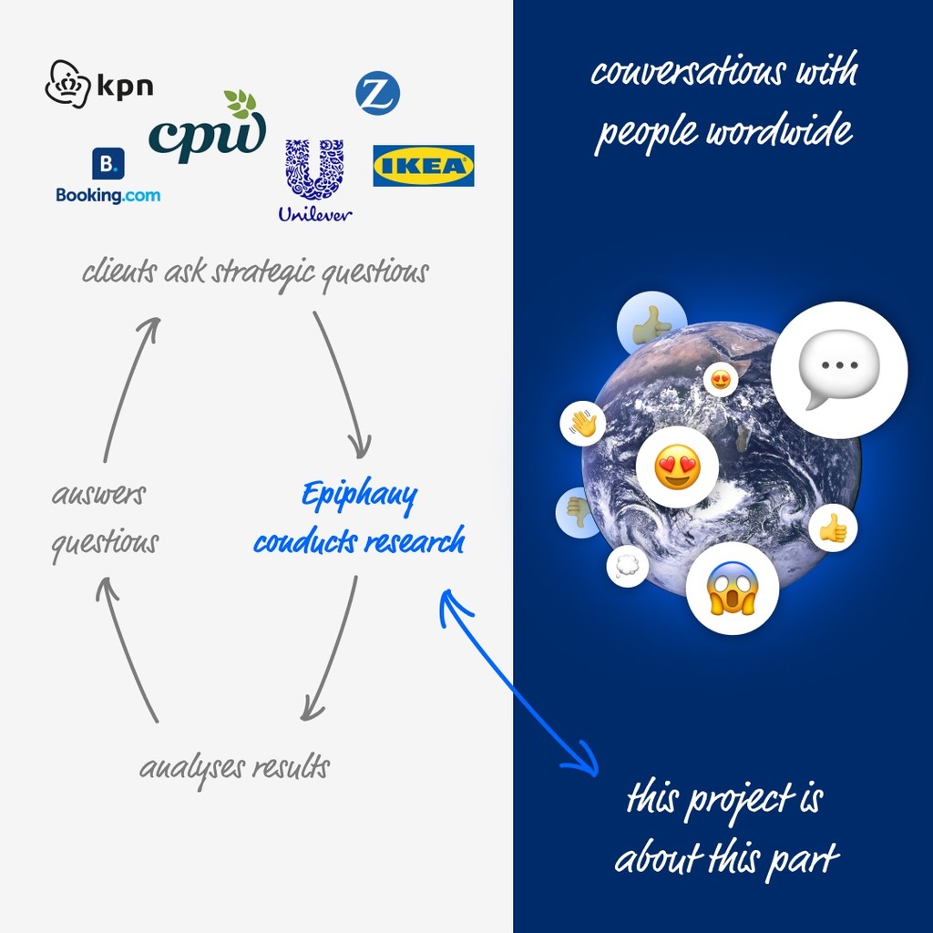
I wanted to show a little bit where this product fall within the full market research process. In fact I have worked on other parts of the process too but I am keeping this case study focused on the chat application. Here's how it works (long story short!). Firstly clients reach out to Epiphany with strategic questions related to their brand, product or approach. Then Epiphany conducts research to learn what people want / think / feel. Next, the skilled researchers of Epiphany analyse the results and get back to the clients with valuable answers. This project is focused on the market research component of the process.
Who are we designing for?
We are literally designing for everyone aged 18 to 90. Market research surveys can have different target groups, for example moms in their 20s or people using their bike to commute to work or ... literary anything else! This application needs to be able to be used in relation to any of these groups. And thus, we are literary designing for everyone. That can be both a curse and a blessing. I'll explain more later!
Market Research
One of the first steps on our process was to learn more about the most popular messaging platforms, like Facebook Messenger, Telegram, WhatsApp and more. Why? Well, simply because we need to learn about the UX and UI patterns that consumers are currently using. Only then our application wouldn't require user onboarding simply because it already feels familiar. It already feels like users want to use it. It already feels like a tool that they have used before.


Tools to be included
I designed the application having a very modular system with 3 areas in mind. The first area is the top bar which we called the status bar. That is the place where users can see who they are talking to but also access the settings of the system throught the 3 dot menu. Then there's the output or conversation area and last but not least we have the input area. That is the area that can change all the time depending on what type of input we are looking for. In research, different types of input can provide different possibilities for analysing it. In this case we have open ends, star ratings, image uploads, single and multi selects and more! This functionality in a way makes the design future proof because only one area needs to be re-thought if we want to add more tools to the mix rather than approaching a challenge like that holistically.


Wireframing
In this phase my team and I mapped out most of the different posibilities in very drafty black and white way. It was intentinally not a detailed representation because we wanted to aproach this challenge holistically and be aware of the different posibilities rather than work on them separately. In a system like this it is almost imposible to map everything at a low level because a lot depends on the user. So we flew high!
The Outcome
White Label in 2 levels!
One of the most important requirements of this project was to ensure the system's look and feel can be adapted to look and feel closer to the research's needs. Why? Because depending on the target group they might like or not like specific colours / backgrounds / styles. Bias at each given moment needs to be as low as possible (it's in fact never 0). The second level of personalisation we added was the possibility for consumers to use the colour they want - a little bit like Messenger does. This functionality is only applicable when the market research brief allows for it. In general though, we found that a high level of personalisation can motivate consumers to feel a sense of control and thus up their motivation to reply and interact with our application.


Prototyping and Usability Testing
We used a few prototypes for usability testing but because of all the different possible flows of a chat application this became very complicated very quickly. We always want to get accurate results in our usability testing and so we tried to make it as realistic as possible.

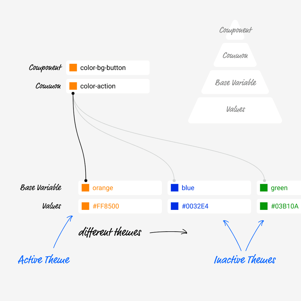
Tokenised Design System
I have built a lot of design systems before so I am aware and up to date with how a tokenised design system works. The challenge this time though was based arround the white laber aspect of the system. In essense, not only colors can be adjusted but also images, host photos, test styles and more. This was quite a challenge but at the end we had a design system that we felt would support all team members that worked with it. Of course, a good design system is never done and in a way it is almost an alive organism. In this case we were confident that we had a super good starting point!
1 more thing: Collaborating with the dev team to pull it off
Collaborating with the developers in this case was super smooth because in a way we were designing this together. Let me explain! This is a super complex system with a lot of different variables, possibilities, outcomes. And when it comes to actually building it we had to make sure that we had all possibilities taken care of and minimised error as much as possible. That is where the development team shined with they "what if" way of thinking. We worked collaboratevely, challenged each other in every step of the way and at the end we were super proud of the product we created!
